

Feature Story
More feature stories by year:
2024
2023
2022
2021
2020
2019
2018
2017
2016
2015
2014
2013
2012
2011
2010
2009
2008
2007
2006
2005
2004
2003
2002
2001
2000
1999
1998
Return to: 2010 Feature Stories
CLIENT: STANTUM
Jan. 20, 2010 : engadget

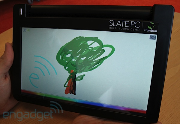
We've had a few run-ins with Stantum before, and never came away less than impressed. This time they sent us their Slate PC concept, which is actually a hacked-up Dell mini 10. The 10-inches of real estate don't seem to hamper Stantum's multitouch, ultra-sensitive and pressure-simulating resistive touchscreen technology one bit. Unfortunately, with stock Windows 7 on here we're not sure this makes much more of a compelling use-case for a "slate" computer than we've seen already littering the halls of CES. Read-on for our full impressions and a video tour.
Something that's surprised us about many slate devices is how heavy they turn out to be. Capacitive glass probably wouldn't help, and it's typically much more expensive than its resistive counterparts. This Dell-based mockup by Stantum is apparently just a regular mini 10 with a ripped-off screen. In place of the keyboard Stantum has put down its own touchscreen LCD, but despite this thrown together nature, the device is actually surprisingly comfortable to hold and relatively light. It's not like it's ready for the mass market as-is, but it's clear that a manufacturer wouldn't have much trouble building a sexy Atom-based form factor to back this display.
One unfortunate note on the LCD: we're not sure if Stantum didn't pick a high-quality part, had some trouble with the hand-built nature of this product, or is really impeding the LCD with its resistive overlay, but there was something cheap and pixelated to the display that we haven't noticed on standard Dell mini 10 LCDs. We're also worried that a slate PC designed like this won't have a way of protecting the screen from the sharp poky objects that sometimes accidentally make their way into our bag -- we'd feel much more secure with some sort of scratchproof glass up front instead of this soft plastic finish.
As for usability, it was exactly on par with the mobile demo we saw at MWC a year ago, though in the scaling up of this tech or the hasty build of this mockup it might've lost just a tad of the pixel-perfect sensitivity we witnessed before (but only just barely). Outside of the lightest of swipes that capacitive is well known for supporting, this is basically the perfect touchscreen experience. 10-finger multitouch, sensing and processing of multi-finger gestures, and simulated pressure sensitivity based on how much of a finger has been pressed down: all of these work brilliantly. Unfortunately, Stantum's software has hardly evolved, and doesn't show much of an excuse for the "perfect" touchscreen outside of artistic or limited gaming applications. If Microsoft is content to let us do everything with a single point of contact at a time, or at best two points (in the case of pinch and rotate) what good is 10-finger pressure-sensitive multitouch when it comes to navigating an OS or actually getting things done?
At least Stantum can say it has a cheap, low-power alternative to capacitive touch in clear working order, and we suppose that's all that's been asked of them.
Return to: 2010 Feature Stories